Thursday, May 23, 2013

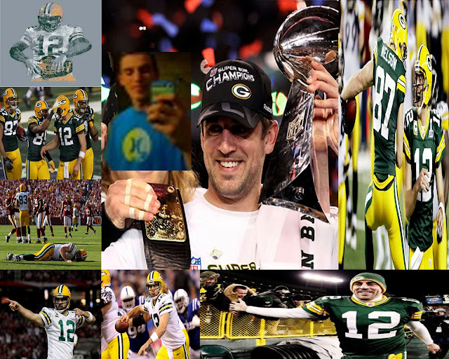
Final - Print Advertisement

Parameters:

Size: 11" x 14" 180 PPI

Must include appropriate Text and Strong Images.

Sell the item of your choosing to your demographic:  What slogan, catch phrases, sayings, information will you use market the product to you?

MUST use all three Rhetoric Persuasive Categories: Pathos (emotion), Ethos ( Endorsement, False confidence) and Logos (logic, information)

Turn in as a JPEG to the hand-in folder by end of class Friday.

Good Luck!


Begin by answering these questions:


What are you selling?


Why should the customer buy it?


Who is your customer?


What does it do?


How will it benefit the buyer?


How much is it?


What are some effective selling techniques you will use to sell your product?


What colors will be used for the “overall” theme of your advertisement?


What is you slogan/catch-phrase that you will use to sell your product?


Tuesday, May 14, 2013

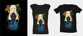
T-shirt Design

Combining the Awesomeness of PS and AI, create an original tee, parameters are below:

Start by doing some research: Who is your audience?  What kind of tee would be likely to sell?  What is considered copywright infringement?

Start by going to: http://www.threadless.com/


Turn-in Requirements:

Step 1. Save the T-shirt Template Design to your profile (My Documents/My Pictures) as an .ai, .psd, or .gif file...or all three. Keep your original layers/work intact, in Illustrator it is best to save for web and devices, and then choose the file type.

Step 2. Turn in to the hand-in folder, D. Chandler, the Template saved as a .jpg at 72ppi and your name.

You can show both the front and back of your tee if you’d like, as well as a few different color schemes (Multiple submissions.)


STEP 3: Create your thumbnail

Your thumbnail doesn’t have to be your entire design, a small piece of it works fine.

This is what people will click on when they want to vote on your design.

Your thumbnail must be a .gif and under 10kb. Using the “save for web” option in

your graphics program to save your thumbnail is definitely recommended.


What makes a good tee?


Here are some things to consider when designing a tee:


Is this something that the Threadless audience would like? (Check out designs


that are for sale in the catalog to see what’s popular.)


Is my design executed technically well?


Is my concept clear?


Has a similar design been done before? If so, how have I improved on the concept


or execution?

Have I listened to critiques and feedback given to me to improve my design?


Is my presentation well done? Is the image saved in a high quality format?


Have I followed the rules for submitting and have created something that is


physically printable?


Wednesday, May 8, 2013

Package Design

Let's apply what we've learned:

Combine Illustrator and Photoshop -

Parameters for full credit:

Size: 8" x 10", 72 PPI - If it ends as a Vector image, that is allright, just make sure the size is correct.
         If you want to do a different size, shape, or package, than the one below, you can, it just has to
         "fit" together.

Must have a background/Color/Theme/Pattern - Cannot be white!

Must have a 100% completely designed and created brand, logo, sign, etc.by YOU!

Think about what product your creating a package for and id you need to specify that product on the labeling.

Must have a minimum of three images, and every surface/plane/side must have something on it.


Tuesday, April 23, 2013

Altered Images and Reality

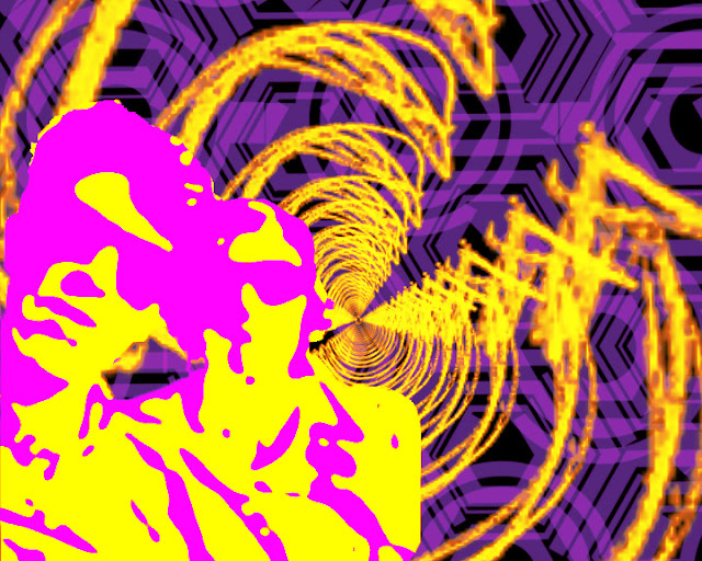
Altered Images and Reality...

Start by getting some custom brushes:

www.brusheezy.com

www.myphotoshopbrushes.com

From there, build a background using layer styles and filters.

Then, you will use an image of yourself,and you will alter the image in whatever way you deem necessary, while still being able to recognize (at least a little) who the image is of. Emphasis here is on using different filters, new, down-loaded and alternative brushes, and finally the Layers palette and options to complete the image. As always remember to use Unsharp mask and the Image>Adjustments>Curves, Hue/Saturation or any other adjustments to complete the image. You have a good amount of time to work on these, so really make sure you use that time to explore the different layers options, brushes and filters to make the best, time-intensive image that you can!

Parameters - Size: 8 x 10 inches, 300 ppi.
Minimum of 8 layers
"Created," new background using at least 3 filters/Layers options.
An altered, crisp, clean image with an overall color-scheme or cohesion (Balance, Rule
of thirds, symmetry, etc.)

Last but not least:  Use PowerPoint to show the "before" and after image, using the 8 layers as the slides to complete the image.

Optional - Time-permitting, do more than one alteration to see different ways to complete the assignment - A couple of extra points will be in it for you if you do!


Exercises:


Tuesday, April 16, 2013

Layer Masks, Curves, Altered Images and Reality

What are layer masks?

One of the most powerful Photoshop features is the possibility to modify the same object again and again and, if you’re not satisfied, go back and return to the original image. I’m not speaking about the history timeline (ctrl+Z), that allow you to eliminate the last steps, but of some functionalities that allow you to have full control on your layers at any time during your workflow. Layer masks represent one of these functionalities.

- Drag and drop the photo of Prague, or save it and open it in photoshop.
- Do your "Photoshop basics, including Unsharp Mask, Hue/Saturation, Free Transform... BUT, hold off on Brightness/Contrast.
- Curves
- Unlock the layer by "throwing away" the lock.


- Duplicate the layer by pressing Ctrl+J (or go to Layer>Duplicate layer).
- Now go to filter>Blur>Gaussian blur and enter a value around 10px:
 - Click on "add layer mask."
 - Ready for the magic?  Grab a black soft brush (reduce hardness to 0%) and start painting over the bridge. Painting over the mask using a black brush we remove that area.Work with white and black brushes, softening and hardening and emphasizing until you are satisfied with the results.

Next, Black and Whites, Color Splash, Gradients!

Everyday, every Picture exercises:


Layer Filters, Color Overlay, Content-Aware Fill, Brushes Brushes Brushes!

www.brusheezy.com

www.myphotoshopbrushes.com

Be very, very careful what you click on!!!  We'll talk in class, but proceed with caution.

Color Overlay:
Select the car’s paintjob
Make sure to exclude headlights, wheels, glass, etc
Use the Magic Wand to click on the main area of the car first, select Lasso, and then hold down Alt to subtract from the selected image, or Shift to add to it.  Keep going until the “running ants” have selected the car without the windshield or lights, tires, etc.
- Select Edit>and then Edit>Paste
-This gives the paintjob its own layer.
Select layer>layer style>color overlay
Change blend mode from “normal” to “color”
Select a color by clicking on the red box