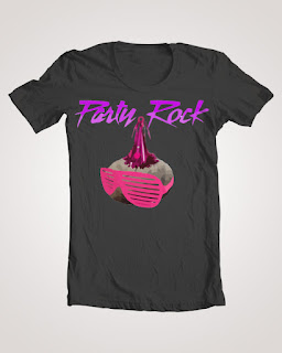
As we finish up the school year, our final 2 page magazine advertisement combes the best of Illustrator and Photoshop. Good luck and enjoy!
Thursday, May 31, 2012
Tuesday, May 15, 2012
Final Parameters: Starting
Background, Item, Explanation, and Slogan...
Begin by answering these questions:
What are you
selling?
Why should
the customer buy it?
Who is your
customer?
What does it
do?
How will it
benefit the buyer?
How much is
it?
What are
some effective selling techniques you will use to sell your product?
What colors
will be used for the “overall” theme of your advertisement?
What is you
slogan/catch-phrase that you will use to sell your product?
Examples:
Monday, May 14, 2012
Onto the Final!
COMMERCIAL ART PROJECT (100
POINTS)
You are a professional graphic
artist, working for a big commercial agency.
You are approached by a company and asked to create a magazine
advertisement that really focuses on their product. This company has requested
that you include a catchy slogan on the advertisement and that the ad should
have a minimal background to it, so not to distract from their product.
Remember, a successful layout considers how each of the Principles of Design
relate to the design and each other.
(The Principles of Design include balance, rhythm, contrast/variation,
movement, emphasis, pattern/repetition, economy, proportion, & unity.)
As a class we will look at several different magazine advertisements to discuss techniques and methods advertisers use to sell their product.
As a class we will look at several different magazine advertisements to discuss techniques and methods advertisers use to sell their product.
You
must decide what you wish to advertise.
Your product should be less than two feet high and wide, because you need
to bring it to school. Remember, you are
not allowed to do any drug, sex, gang, or violence related art in my class. You
cannot use any celebrity endorsements to sell your product. After you choose an account, you need to have
your product and slogan approved by your boss (the teacher). Then bring in the object that you are
advertising. We will set up a shooting
studio so that you can digitally photograph your product. Download your image and begin creating a
successful and marketable advertisement in a 8” x 10 ½” Photoshop or Illustrator
file.
When
creating your design you should think about color, text, and focal point or
emphasis (along with all the other Principles of Design). The emphasis (center of attention) should be
on the product you are trying to sell.
You should also have some kind of slogan to sell your product. When creating text, I expect you to use an
appropriate font to create or go along with the mood of your ad. Remember, you want to catch the viewer’s eye
and draw attention to your product, because you only have 3 seconds to do so
(the time it takes to turn a page). So,
be creative!!!
Tuesday, April 24, 2012
T shirt Design!
What makes a good tee?
Here are some things to consider when designing a tee:
Is this something that the Threadless audience would like? (Check out designs
that are for sale in the catalog to see what’s popular.)
Is my design executed technically well?
Is my concept clear?
Has a similar design been done before? If so, how have I improved on the concept
or execution?
Have I listened to critiques and feedback given to me to improve my design?
Is my presentation well done? Is the image saved in a high quality format?
Have I followed the rules for submitting and have created something that is
physically printable?
Turn-in Requirements:
Step 1. Save the T-shirt Template Design to your profile (My Documents/My Pictures) as an .ai, .psd, or .gif file...or all three. Keep your original layers/work intact, in Illustrator it is best to save for web and devices, and then choose the file type.
Step 2. Turn in to the hand-in folder, D. Chandler, the Template saved as a .jpg at 72ppi and your name.
You can show both the front and back of your tee if you’d like, as well as a few different color schemes (Multiple submissions.)
STEP 3: Create your thumbnail
Your thumbnail doesn’t have to be your entire design, a small piece of it works fine.
This is what people will click on when they want to vote on your design.
Your thumbnail must be a .gif and under 10kb. Using the “save for web” option in
your graphics program to save your thumbnail is definitely recommended.
Subscribe to:
Comments (Atom)


.jpg)


